How to Choose Floor Tiles That Blend Perfectly with Your Wall Colors & Decor
- Cohere

- 1 day ago
- 3 min read

Choosing floor tiles isn’t just about picking a color you like, it's about creating visual balance between floors, walls, light, and furniture. In Indian homes, especially apartments and villas, the wrong tile wall combination can make a space feel darker, smaller, or visually chaotic, even if each element looks good on its own.
After years of interior designing homes in Bangalore and similar tropical settings, one principle always holds true: floors should quietly support the walls and décor, not compete with them. This guide breaks down how to choose floor tiles that blend seamlessly with wall colors and interior décor using practical design logic, not trend-driven guesswork.
1. Start With Light, Not Color
Before matching tiles to wall paint, understand how light behaves in your home. In tropical cities, lighting varies dramatically:
North- or east-facing homes receive softer, diffused light
West-facing homes get harsh afternoon sun
Apartments often rely on artificial lighting during the day
Design rule:
Always select floor tiles after assessing natural light, not before choosing wall colors.
Dark tiles in low-light rooms absorb light and make walls appear dull. Lighter or mid-tone tiles reflect light upward, enhancing wall color clarity.
2. Match Undertones, Not Exact Colors
A common mistake is trying to match tiles and walls by shade. Instead, match them by undertone.
Understand undertones:
Warm: beige, cream, ivory, taupe
Cool: grey, off-white with blue base
Neutral-balanced: greige, muted stone shades
Best practice:
Warm walls → warm or neutral tiles
Cool walls → neutral or cool-balanced tiles
Avoid mixing warm floors with cool walls unless contrast is intentional and controlled
This single adjustment instantly makes spaces feel cohesive.
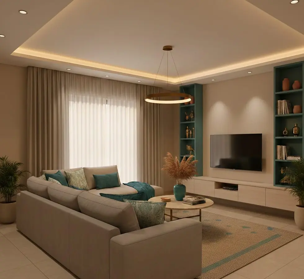
3. Living Rooms: Create Flow, Not Focus
Living rooms benefit from visual continuity, especially in open-plan layouts.
What works best:
Light to mid-tone vitrified or porcelain tiles
Subtle patterns or stone textures
Matte or soft satin finishes
Avoid:
High-contrast dark glossy tiles with light walls
Heavy patterns that compete with furniture and rugs
Design intent: Let walls, furniture, and décor stand out; floors should anchor the space quietly.
4. Bedrooms: Choose Calm Over Contrast
Bedrooms are where tile–wall harmony matters most emotionally.
Ideal combinations:
Beige, taupe, or soft pastel walls
Wood-finish or matte tiles in warm tones
Minimal pattern movement
Why it works: Low contrast between walls and floors creates a relaxed, cocooning effect essential for restful spaces.
Pro tip: If you want darker flooring, balance it with lighter walls and lighter furniture to avoid visual heaviness.
5. Kitchens: Balance Brightness and Practicality
Kitchens need to feel bright, but also hide stains and wear.
Recommended pairings:
Light walls → mid-tone matte tiles
Neutral backsplashes → floors with slight texture
Avoid pure white floors—they show every mark
Best tile types:
Matte porcelain
Subtle terrazzo-look tiles They visually tie into cabinetry and countertops without overpowering wall colors.
6. Bathrooms: Use Tone-on-Tone Strategy
Bathrooms feel larger when walls and floors belong to the same color family, with slight variation.
Smart combinations:
Light walls + slightly darker floors
Same tile family in different sizes or finishes
Matte floors with satin-finish wall tiles
Important detail most homeowners miss: Grout color should sit between wall and floor tones; it acts as the visual bridge.
7. Tile Finishes Matter as Much as Color
Finish changes how a color reads:
Finish | Visual Effect |
Glossy | Reflects light, exaggerates color |
Matte | Softens tone, hides imperfections |
Textured | Adds depth without contrast |
Rule of thumb:
Small rooms → matte
Large, well-lit rooms → satin or low-gloss
Avoid glossy tiles on dark floors in compact spaces
Correcting Dark Floor: Wall Clash in a 3BHK
In a mid-sized apartment, dark floor tiles initially made beige walls look muddy and closed-in. Switching to light wood-finish vitrified tiles with warm undertones instantly improved brightness and created a continuous flow across rooms without changing wall paint.
Lesson: When floors overpower walls, the fix is usually undertone and reflectivity not repainting.
Glossy vs Matte in Compact Homes
In another apartment, glossy tiles amplified reflections, making neutral walls feel noisy rather than elegant. Replacing them with matte porcelain tiles in a soft taupe restored visual calm and allowed wall décor to stand out naturally.
Lesson: Calm interiors rely on controlled surfaces, not shine.
Three Costly Mistakes to Avoid
Dark glossy tiles in small rooms: visually shrink space
Ignoring lighting direction: colors change throughout the day
Overlooking grout color: it can break or bind the entire scheme
Final Thought: Design From the Ground Up
The best interiors don’t start with wall paint, they start with the floor. When floor tiles, wall colors, and décor speak the same visual language, homes feel intentional, spacious, and timeless. If you’re unsure, step back and ask one question:
Does this floor support the walls or fight them?
That answer usually reveals the right choice.