
Best Wall Color Combinations for Indian Homes: Expert Interior Design Guide
- Cohere

- Feb 19
- 3 min read
Choosing the right wall color combinations for Indian homes is not just a design decision, it's a technical one influenced by natural light, climate, spatial proportions, and daily lifestyle patterns. As an interior designer in Bangalore with over 12 years of hands-on experience working on residential apartments and villas, I’ve seen how wall colors that look perfect on a sample card can behave very differently once applied in real homes.
This expert guide is built on real execution experience, not theoretical color charts. It focuses on wall color combinations that perform well in tropical Indian conditions, align with Vastu sensibilities, and remain timeless rather than trend-driven.
Why Wall Color Selection Is Different in Indian Homes
Indian homes experience dramatic daylight variation, harsh noon sun, soft mornings, overcast monsoons, and warm artificial lighting in the evenings. Colors that look perfect on a swatch often behave very differently once applied on-site.
Design principle I follow on every project: Lighting must be layered and finalized before approving wall colors. Without this step, even the best color combinations can fail.
1. Beige + Teal: A Timeless Living Room Combination for Indian Apartments
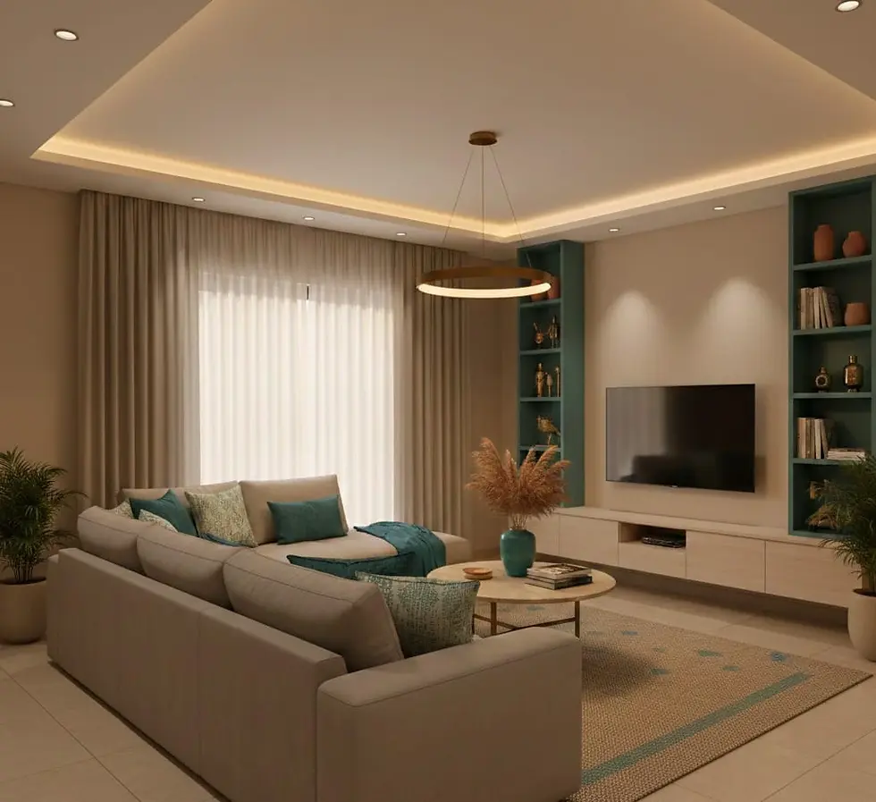
Best suited for: 2BHK-3BHK apartments, especially under 1,500 sq ft
Beige remains one of the safest and most versatile base colors for Indian homes. When paired with teal, it introduces depth and personality without overwhelming the space.
Why this works well:
Beige enhances brightness in low-daylight apartments
Teal provides a modern accent without visual heaviness
Works exceptionally well with matte finishes and warm lighting
This combination is ideal for homeowners who want a modern yet calm living room that ages gracefully.
2. Taupe + Natural Wood: Elegant Wall Colors for Villas and Larger Homes

Best suited for: Independent homes and mid-size villas
Taupe sits perfectly between grey and beige, making it highly adaptable to Indian lighting conditions. When paired with natural wood tones, it creates a sense of warmth and understated luxury.
Design benefits:
Prevents large walls from feeling cold or empty
Complements wooden furniture, flooring, and paneling
Ideal for clients seeking a premium, timeless aesthetic
This combination is especially effective in homes with open layouts.
3. Warm Neutrals + Mustard Accents: Adding Depth Without Overpowering

Best suited for: Large villas and open-plan homes
Warm neutrals form a balanced base, while mustard introduces controlled vibrancy rooted in Indian design sensibilities.
Why designers love this palette:
Reduces the sterile feel of cool-toned homes
Adds cultural warmth without being traditional-heavy
Works well in accent walls, niches, or soft furnishings
Used sparingly, mustard enhances richness without dominating the space.
4. Wall Color Strategies for Small Indian Apartments

Small homes demand restraint and clarity. One of the most common mistakes I see is using dark or overly contrasting colors in compact rooms.
What works better:
Off-whites, soft greige, sand tones
Minimal accent walls only where lighting allows
Matte emulsions that diffuse light evenly
Key insight: In small apartments, space should feel layered, not divided by color.
5. Kids’ Room Wall Color Combinations That Grow With the Child

Bright primary colors are popular but rarely practical long-term.
Better alternatives:
Soft blue + warm white
Pastel green + light wood
Muted peach + ivory
These combinations support focus, rest, and longevity while allowing furniture and décor to evolve as children grow.
6. Pooja Room Wall Colors: Balancing Vastu and Contemporary Design

Many Indian homeowners seek Vastu alignment without strict rules.
Recommended palettes:
Soft yellow or cream for North-East zones
White with subtle gold or brass accents
Avoid dark or overpowering tones
The goal is serenity and clarity, not visual dominance.
Explore Our Featured Design Projects
Our villa landscape design project at Brigade Orchards showcases how warm wall tones and material coordination enhance indoor–outdoor living in a premium residential setting near Bangalore.
Our Parisian penthouse interior design project in Cox Town demonstrates refined wall color layering, soft neutrals, and accent detailing tailored for an upscale urban apartment in Bangalore.
Final Expert Advice on Choosing Wall Color Combinations
Before finalizing any wall color:
Plan lighting first
Observe colors at different times of day
Align shades with room function and direction
Coordinate with flooring and furniture
Choose finishes as carefully as colors
Well-chosen wall colors don’t stand out; they make the home feel right.


